
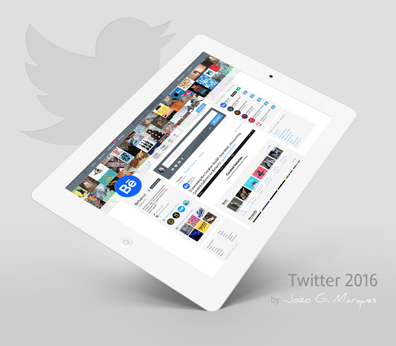
A quite about
This is my first UX/UI project and also first project on Behance, inspired by the passion people have for that dear and favorite social networking. These are just some numbers about Twitter: 310 million of monthly active users, 1 billion of unique visits monthly to sites with embedded tweets, 79% of accounts are outside the U.S., 35+ offices across the world, 40+ Languages supported and 3,800 employees worldwide.
My objective here is simple: spread ideas and trying make ideas happen. I worked as a front-end developer and PHP programming for some years, however what really makes me happy and feel proud to have left journalism back is the design and the creative spirit that we all have regardless of our profession. Besides all that, Twitter is an amazing tool and this is a simple and humble proposal for something that I really appreciate: how genius is Twitter, both for people and for companies.
My proposal was partially change the interface and reset some important elements based not only on my user experience but in general, they are details necessary to have the best possible user experience. The major change was the typography, migrating to something modern, clean and great aesthetics, with the intention to be a better option to Helvetica.

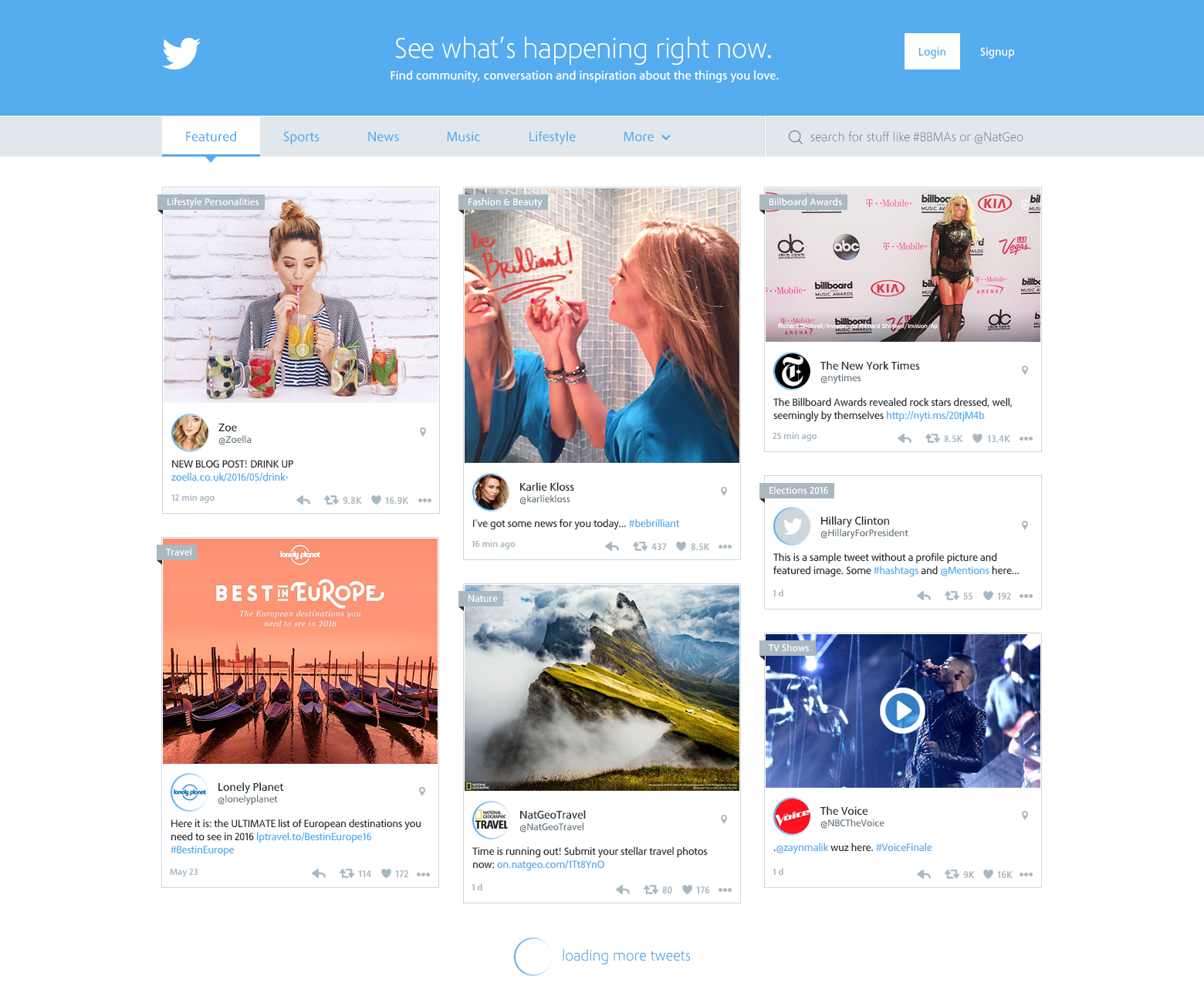
Default homepage (Moments)
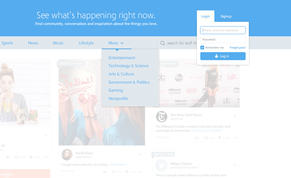
New homepage dropdown menus, more spaced and clean
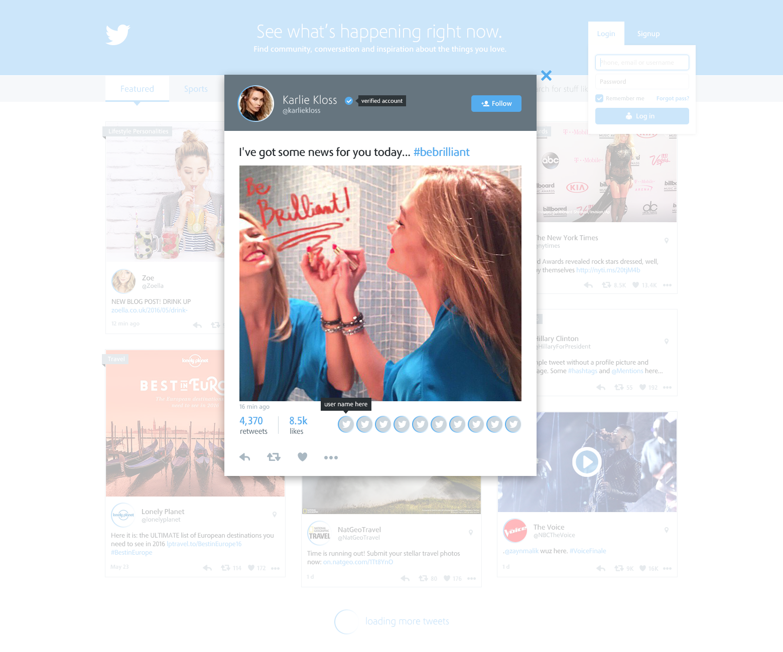
Homepage tweet lightbox
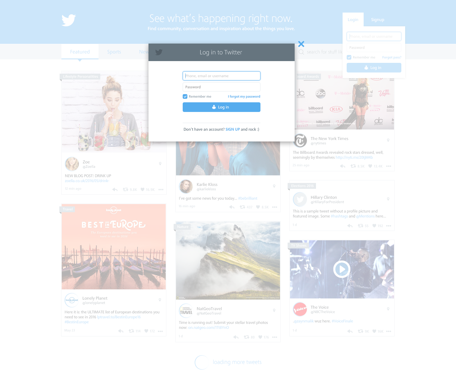
Login lightbox (default for every screen)
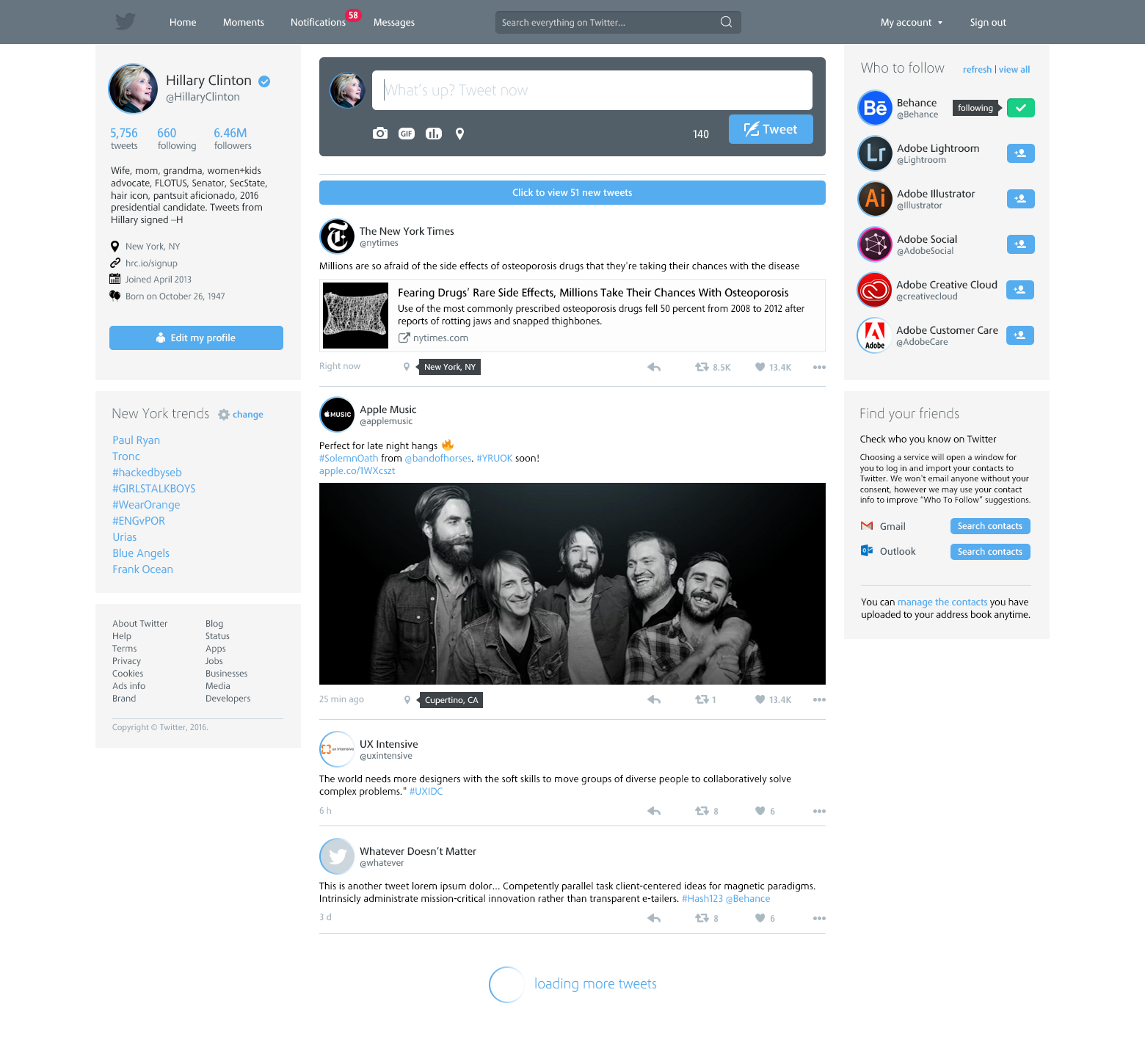
Home for logged in users
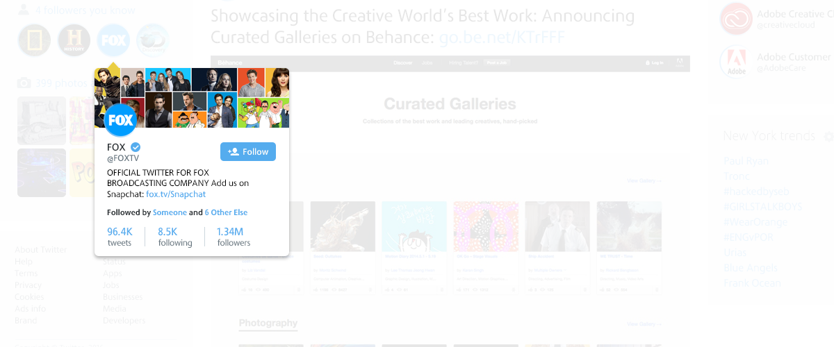
New topbar highlighting search and notifications. On left side, we have user details, more accessible, with a Edit button below to make users life easier, better than having to find a "freaking" button or option to edit and customize our profile. Following user data there are some trending topics, according to his/her location preference. We're still talking about logged in user, so it's important to keep those trends on left.
On the middle, a large featured box inviting user to tweet something, avoiding a click or "tap" just to open a lightbox when user wants to tweet. Below, a call-to-action button to see new tweets and, following, more tweets. The tweet actions were moved to right, considering that on the right we have more blank space, which makes those actions more visible to user.
On the right side, we have the Who To Follow box with current Twitter structure except for Follow buttons: default "Follow" text was removed to make buttons more compact and save space while keep them intuitive, preserving its usability. To finish, user wouldn't have to find an option to "import friends" on the menu, he/she would be able to import contacts to Twitter directly through a box without requiring unnecessary clicks and making users life easier to find their friends and add them quickly.
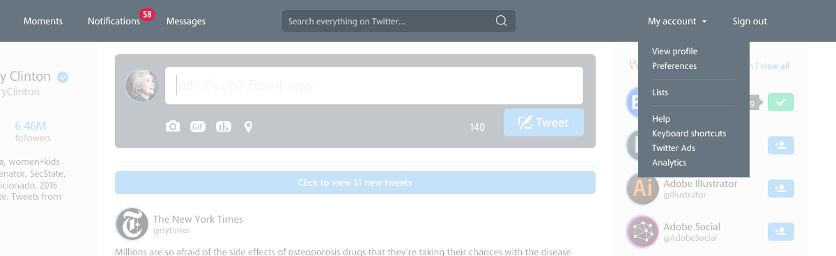
My Account menu (dropdown on hover to avoid click)
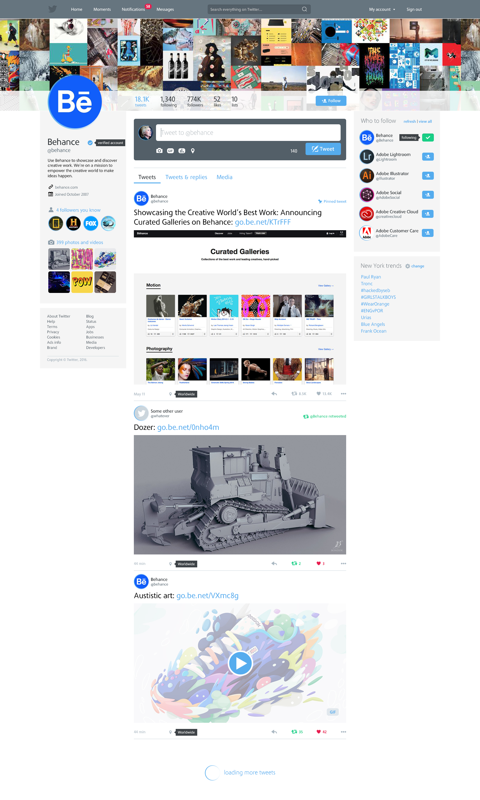
Visiting a profile
Just the tooltip for a user profile mouseover
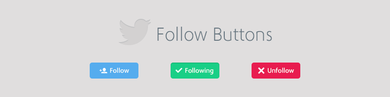
Finishing, follow buttons
That's it! I didn't create other pages because main changes already were expressed through these screens above. Obviously, if we would discuss about every UX point of view, we would stay here forever, so, I just wanted to show my ideas and hope everyone like this simple project, however with a great purpose.